A mobile tooltip is a guide that appears next to a specific element in your app. Tooltip guides are used to highlight a specific feature on a new feature launch or to increase discoverability. Tooltips can also be part of guided walkthroughs or onboarding flows. For more information, see Add a multi-step guide on your mobile app.
Permissions
To use the Visual Design Studio, Pendo users need one of the two following permissions:
- Pendo Administrator Permissions
- Pendo User Permissions with at least one of the following:
- Create Guides from Layouts
- Manage Published Guides
Create your guide
- Create a new guide.
- Select a tooltip layout. You can use any of the pre-built layouts Pendo offers or create your own. The guide's details page opens showing your new tooltip guide.
Tooltip location
You can change the element and the default position of the tooltip in the Location tab in the Edit container dialog. If the selected element doesn't leave enough space on the screen for the tooltip, Pendo automatically repositions it.
Visual Backdrop
By default, the target element is exposed above the backdrop to allow the user to select it. The tooltip closes or advances after the user clicks on the target element. To customize settings for the visual backdrop, go to the Styling tab in the container:
- Remove the backdrop. Users can click through the app and after they do, the tooltip closes or the tour advances.
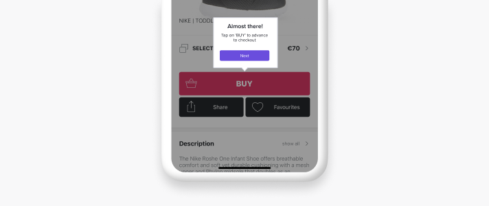
- Show Target Element Above Backdrop. Elements and other areas on the screen beneath the backdrop aren't clickable. This can be used when you want to highlight a specific feature or when providing a guided walkthrough where the user needs to proceed with the tour. This option is used together with tooltip buttons.
Create a small guidance tooltip
To highlight a specific feature of yours through a tooltip, consider whether you want this tooltip to block the app. For a tooltip that disappears after the user clicks on the screen:
- Select a layout without buttons, such as Tooltip small Helper.
- Select a Page and an element for your tooltip's location.
- In the Styling tab, remove the visual backdrop. This means that your tooltip closes after the user clicks on the screen.
Create a tooltip with buttons
Sometimes you want the tooltip to highlight a feature, but you want the user to stay on the same page for the next step. In this case, add a tooltip with an 'OK'/'Got it' button and prevent the user from clicking the Feature:
- Select a layout with buttons or add buttons to an existing tooltip.
- In the Styling tab, deselect Expose target element above backdrop. This allows for the tour to advance or be dismissed only by selecting the tooltip's buttons.
Build a tour that spans several app pages
A tour that guides the user through a specific flow in your app sometimes requires the user to select the target element to advance the flow. Here's our recommended way of implementing this:
- Select a layout without buttons, such as Tooltip small Helper.
- Select a Page and an element for your tooltip's location.
- Leave the default settings to include a backdrop and expose the target element above the backdrop.
Add tooltips for Android Native apps using Jetpack Compose
Note: This offering is in open beta.
Tooltip guides are based on location and are anchored to a specific Feature. From SDK version 3.3.0, you can use Pendo tags in a code-based environment to identify Features where you want to attach a tooltip guide.
Note: Before you use a Pendo tag to set the location of a tooltip, make sure that a developer has integrated the SDK correctly. For more information, see the Github site. Any Pages where Pendo tags were added in SDK version 3.3.0 will need to be recaptured when you upgrade to SDK version 3.4.0.
- Identify a Feature in your app where you want to place the tooltip guide.
- In your application code, add a
pendoTagwith a unique identifier on the Feature using the following code:
someComposableObject(
     modifier = Modifier
          .pendoTag("UNIQUE_IDENTIFIER")
)
Note: Pendo Tags are case-sensitive.
- Tag the relevant Page in the Visual Design Studio and set the location for the tooltip guide on the Feature you identified.